At the end of October, I got an inquiry from the executive director for the Wisconsin Council of Churches, asking if I would be interested in taking on a commissioned piece on the theme “It is for these days we have been baptized.” The prints are to be used as a thank you gift for outgoing members of their board, and are to be virtually presented at their virtual annual meeting today, December 8th.
I’m always glad with a commission like this to have the luxury of time to let ideas percolate for a while, and particularly in this case, where I was just a few days out from serving as a poll worker in the election, and then quarantining away from my family (and my studio) for two weeks after that, and then launching right into doing on online show and trying to print some new Christmas-related stock and promote sales. And then, somehow, Thanksgiving.
So ideas really did have a good while to percolate before I could really work on this in a hands-on way in my studio.
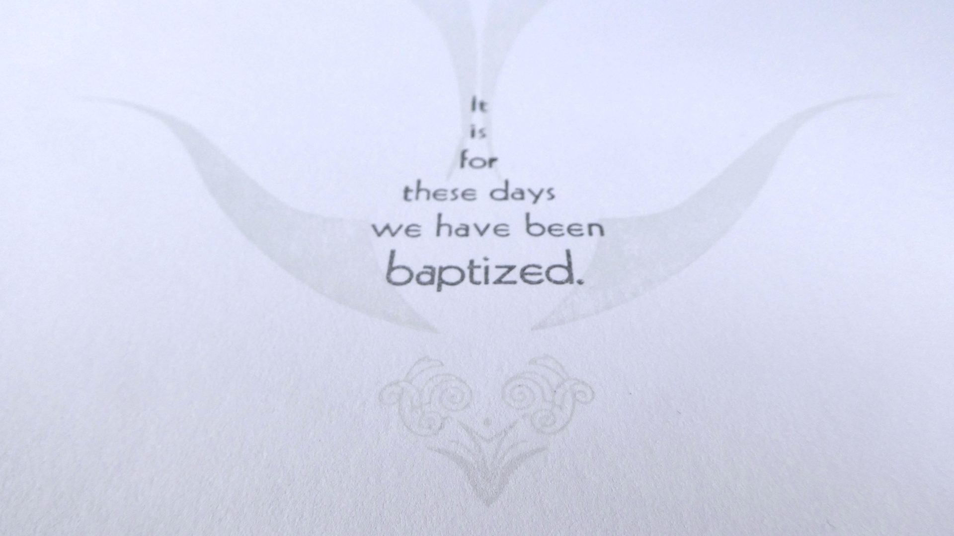
It is for these days we have been baptized.
“It is for these days we have been baptized.” What can this begin to mean, in this year of all years? The phrase “these days,” situated in the year 2020, will probably carry an extra weight for the rest of our lives—for those of us who live through them. Because these days have been so much: A pandemic. Global warming. Massive wildfires. Floods. More hurricanes than any previously recorded year. A mass protest movement for racial justice. An election year where the stakes on all sides seem higher than ever before, leading to historic levels of voter turnout. These days seem to keep escalating, and it’s hard to keep up. These days are days that have upended lives, changed how we work and live and play, have unsettled us deeply. These days can feel chaotic, and lonely, and also intense and meaningful; they have forced us to confront reconsider what is important, and what we should do.
To say that it is for these days that we have been baptized is surely a call to action. It is to say that baptism obligates us. And what is it to be baptized? This rite of Christian initiation is a ritualized act of cleansing, a spiritual bath, but it is also a symbolic death and resurrection. Different Christian denominations emphasize this in different ways in their practice of the sacrament, but there is no doubt both elements are there. It is for these days that we have been washed clean. It is for these days that we die and rise again.
So how should I visualize these days, and being baptized into them? The most symbolic representations for Baptism are water and a dove, drawing on both the rite as it is practiced and the description of the baptism of Jesus in the Gospels. Both water and the dove have long been used by Christians as symbols of the Holy Spirit, and seemed like a good place to start.
And so I started working on water. Now water has many forms: still water, deep water, flowing water. Rivers & streams, lakes & ponds, puddles & waterfalls. Rain. Hurricanes. Floods. This year, for so many, has been full of literally and metaphorically turbulent water. Dangerous water. Troubled water.
And so, as I set about looking through my collection of type ornaments, running through my mind repeatedly was the chorus of the African American spiritual:
Wade in the water.
Wade in the water, children.
Wade in the water.
God’s a-gonna trouble the water.
I pulled out type with curves and waves, curls and swirls. In particular, pulled out a small set of large wood type “pointers” made at the Hamilton Wood Type museum. I use these pointers a lot, because their graceful curved shapes help break up the rigid grid and straight lines that letterpress can be prone to. I also pulled out a box of much smaller versions of the same shapes, in somewhat worn metal type, along with an assortment of other metal type ornaments, including some swirling “pen flourishes” and other shapes suggestive of water in motion.
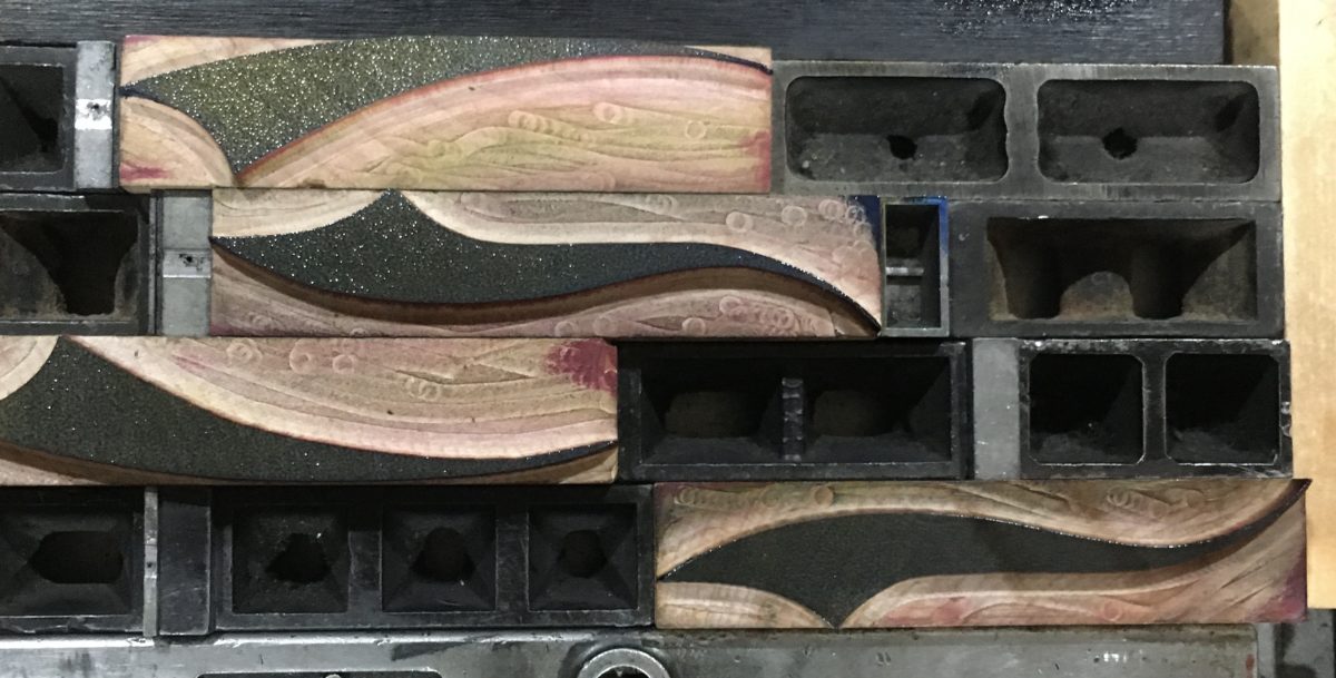
I started with the wood pointers, because their bigger size would define the water on the page, and I built a type form that defined that space for the water on the page, but would allow me to easily shift pieces around within that space. This would let me re-use the same pieces in different positions and orientations to stack layers in different shades of blue, suggesting motion and turbulence. Around the first layer of wood pointers, I built an array of smaller metal type swirls and swashes and flourishes, to be printed very lightly, and then pulled out the wood pointers because wood & metal type often don’t print well together.
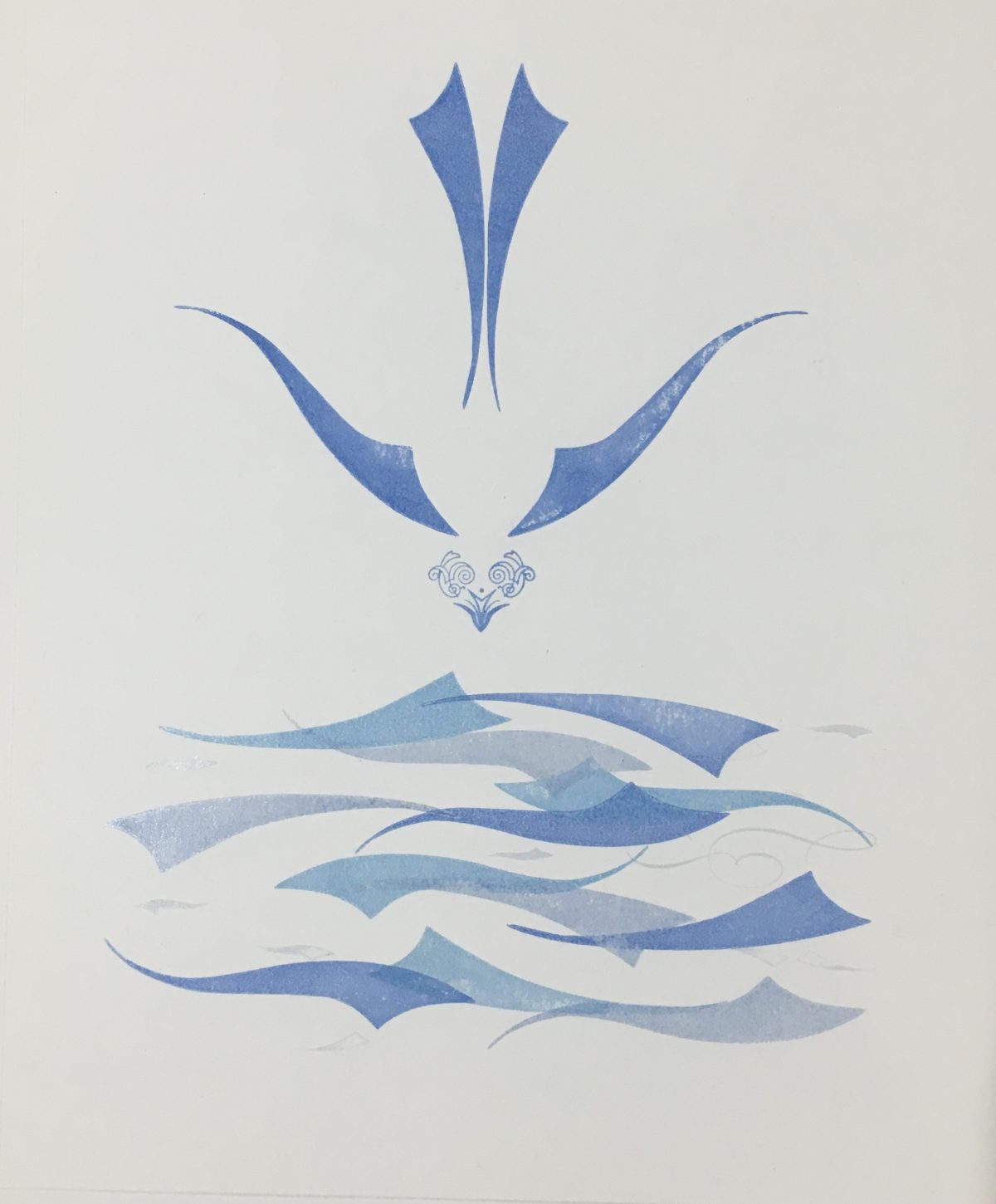
Then it was time to start putting ink on paper. Letterpress inks go down in a very thin layer, and are somewhat transparent by nature, but I wanted to start with a very light color and a lot of transparency, and so I started with a big dollop of transparent ink, which is basically the clear ink base without any pigment. Then I mixed in just the tiniest amount of Reflex Blue, which is a dark, purple-leaning blue, along with a tiny bit of opaque white to help the soften the color. I used this to print the metal type, and then I put the wood pointers back in and took the metal out, and start building layers. I added a little Process Blue to the ink, which is the Cyan in CMYK color printing, and rearranged the pointers.

One more layer with a little more of the darker blue in the mix, and it was starting to look like the choppy, agitated, troubled waters I had been thinking of. Now it was time to figure out the dove. I had already worked out that the same wood pointers I used for the water could be used in a different arrangement to make a shape suggesting a dove, and while I had ink out it was time to do some tests to see how they looked. I worked out three variations that all used the exact same pieces, but came out looking very different:
A 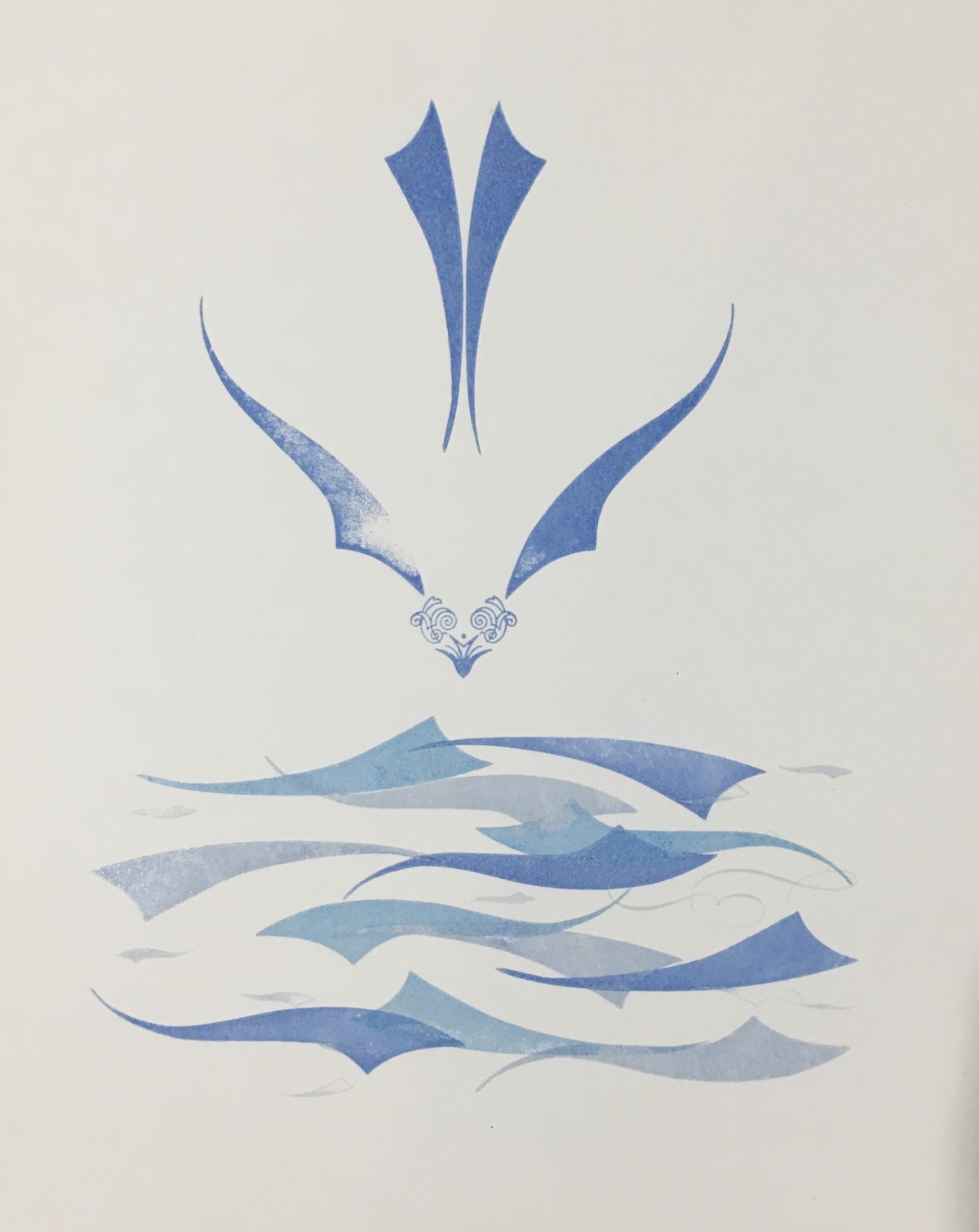
B 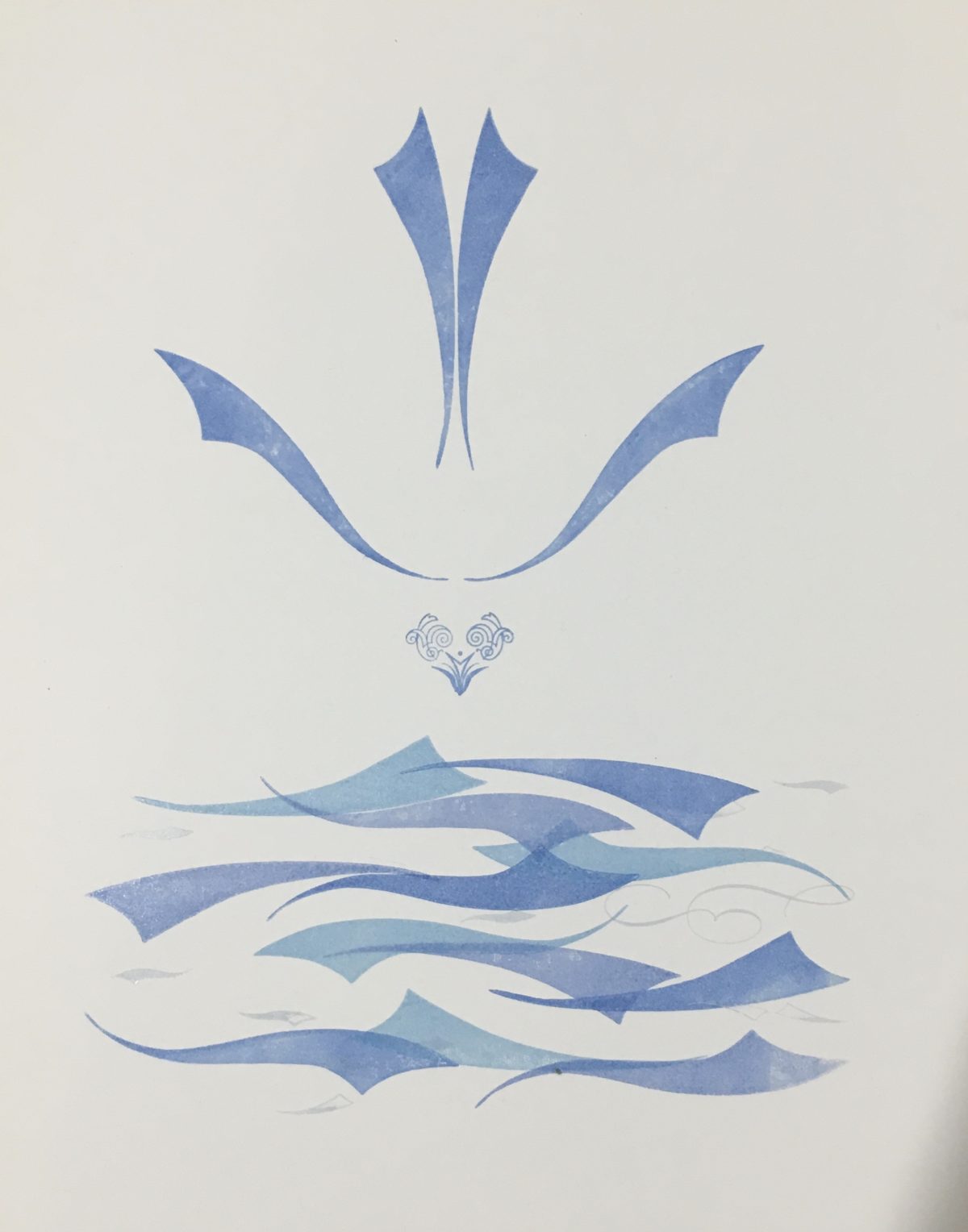
C
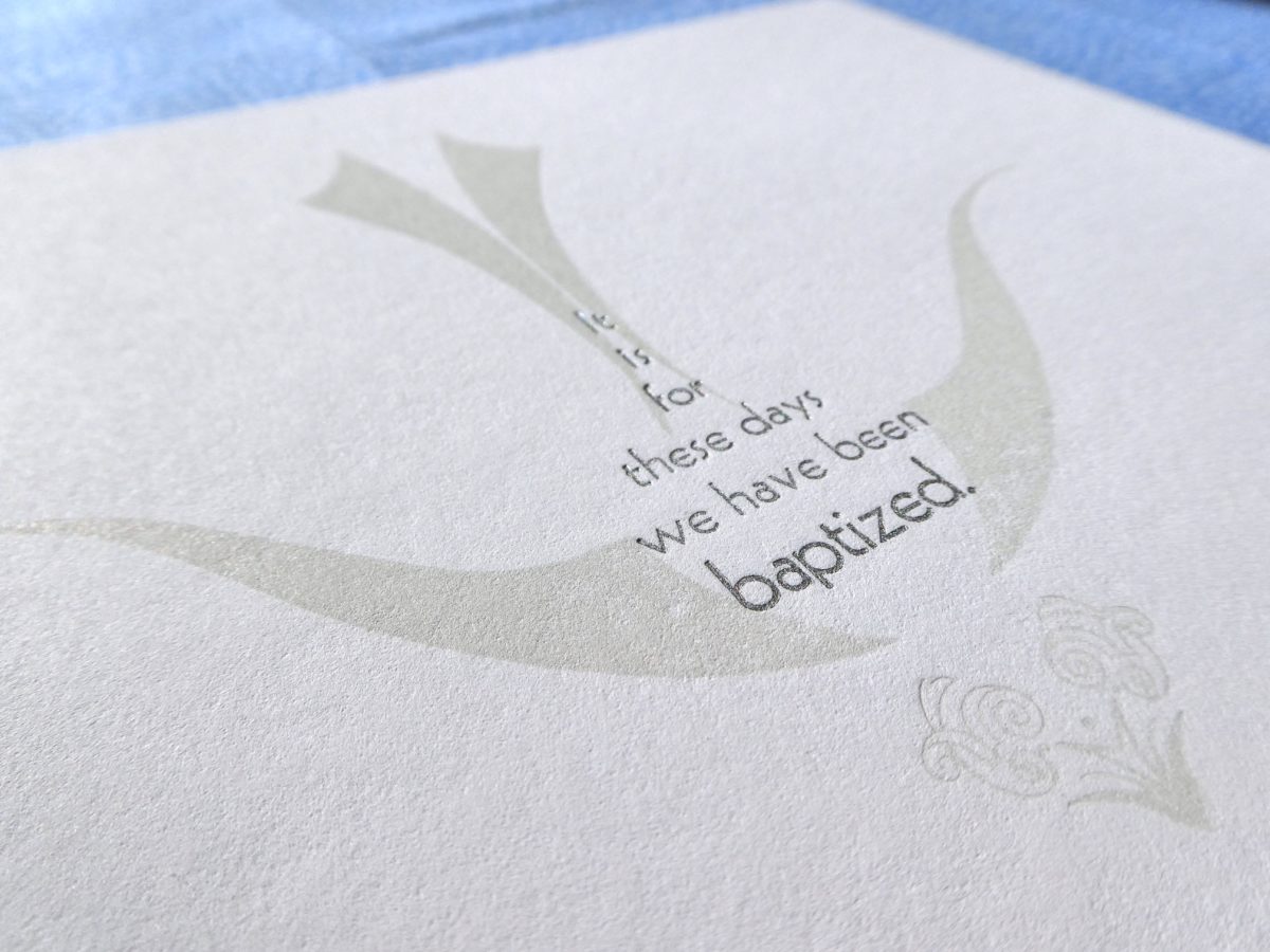
There are things I like about each of these, and I may use some of the others on some other projection the future, but version A seemed a little more dove-like and graceful in the curve of its wings, and also the negative space between the shapes better implied the body of the bird, while also maybe suggesting the shape of a drop of water, or a teardrop. I liked that, and then it hit me that I could probably fit the text for the print into that space—perfect!

The next step was to work out the right color for the bird. I wanted something subtle, just barely darker than the bright white paper I was printing on. I went back to the transparent ink, and added a little bit of metallic silver ink—I was hoping for just a little shimmer—and a little bit of the Reflex Blue to tie it to the colors in the water. I ended up with an interesting chameleon color that looked white on the type, like a very light grey in my studio light, and more like a very light tan in sunlight. Not quite what I was aiming for, but I really like how it came out!
Along with the dove, I added one more layer of metal ornaments to be printed in the same light grey color on the water, to add some subtle detail that I think really helps add to the feeling of motion and turbulence in the water.


Once I had printed these, all that was left to print was the text. It took a little experimentation to find a typeface with the right visual weight and size to fit into the space in the body of the dove and help suggest the rest of that form. I ended up going with straight up metallic silver ink for the type, finally getting a little of the shimmer I had been hoping to add into the print all along. The silver pops on the page, giving a little extra emphasis to the text, and drawing the eye to the dove around it, even as it changes how the whole print looks depending on the angle the light hits it.

And with that addition, the print was complete, the dove poised just above the surface, just on the brink of diving into those churning waters.
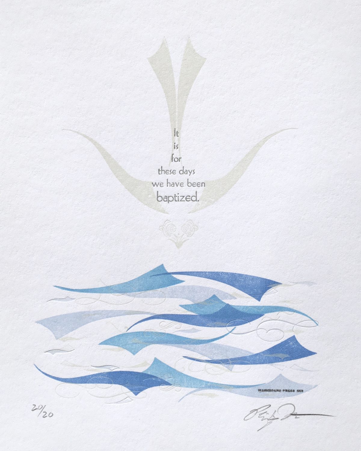
We are baptized in water and the Spirit. We plunge down, into the waters. It is for these days—troubled, turbulent, and chaotic as they are—that we have been baptized. May we dive in with the Spirit, and rise again.


