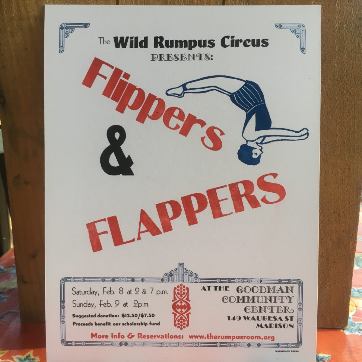
Back in January, I had a lot of fun designing a promotional poster for the Wild Rumpus Circus, a local circus school that my daughter has been involved in for several years now. They had decided to go with a 1920’s-themed show for their annual winter circus, so I pulled out my best 1920’s typefaces and went to work.
The title of the show was “Flippers and Flappers” —a reference to acrobatics in the show, as well as to a recurring gag in the clown acts. Although by the 1920’s most circus posters were printed using lithography, I wanted to try and evoke some of their feel, while still keeping with the limits of my type collection.
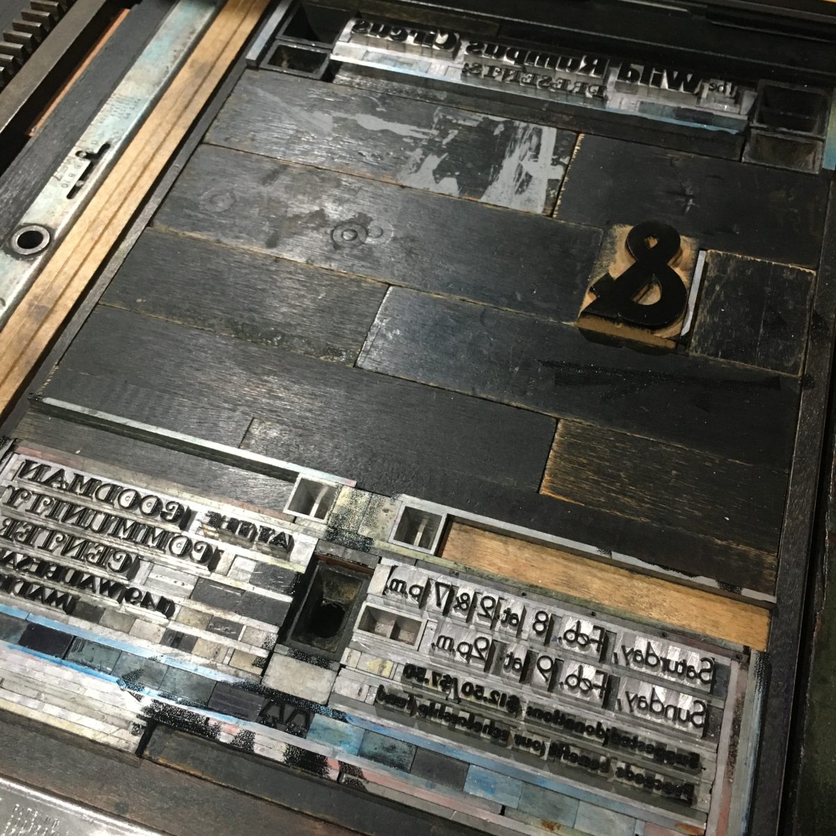
I started with a mostly typographic treatment, with some art-deco ornamentation around the information block, and placing the title on two angles to help give a sense of movement.


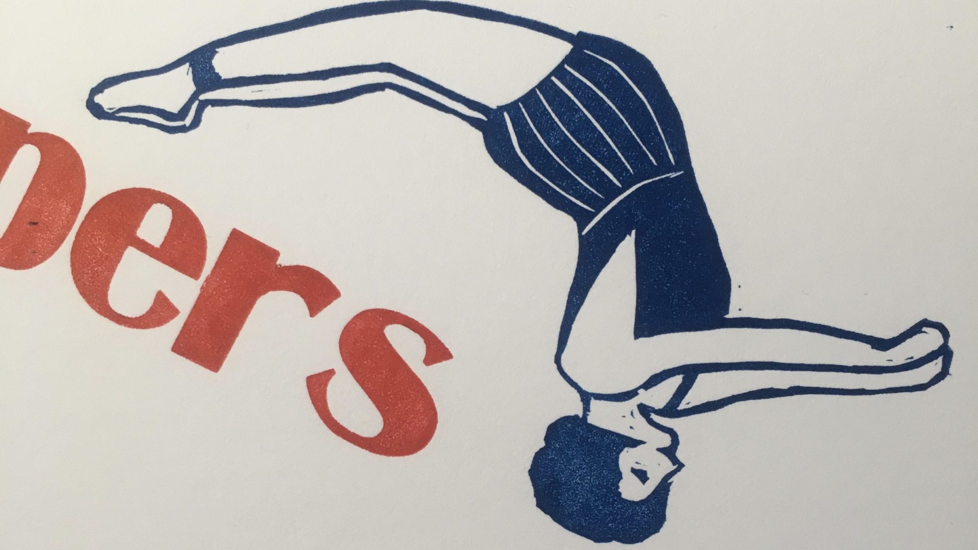
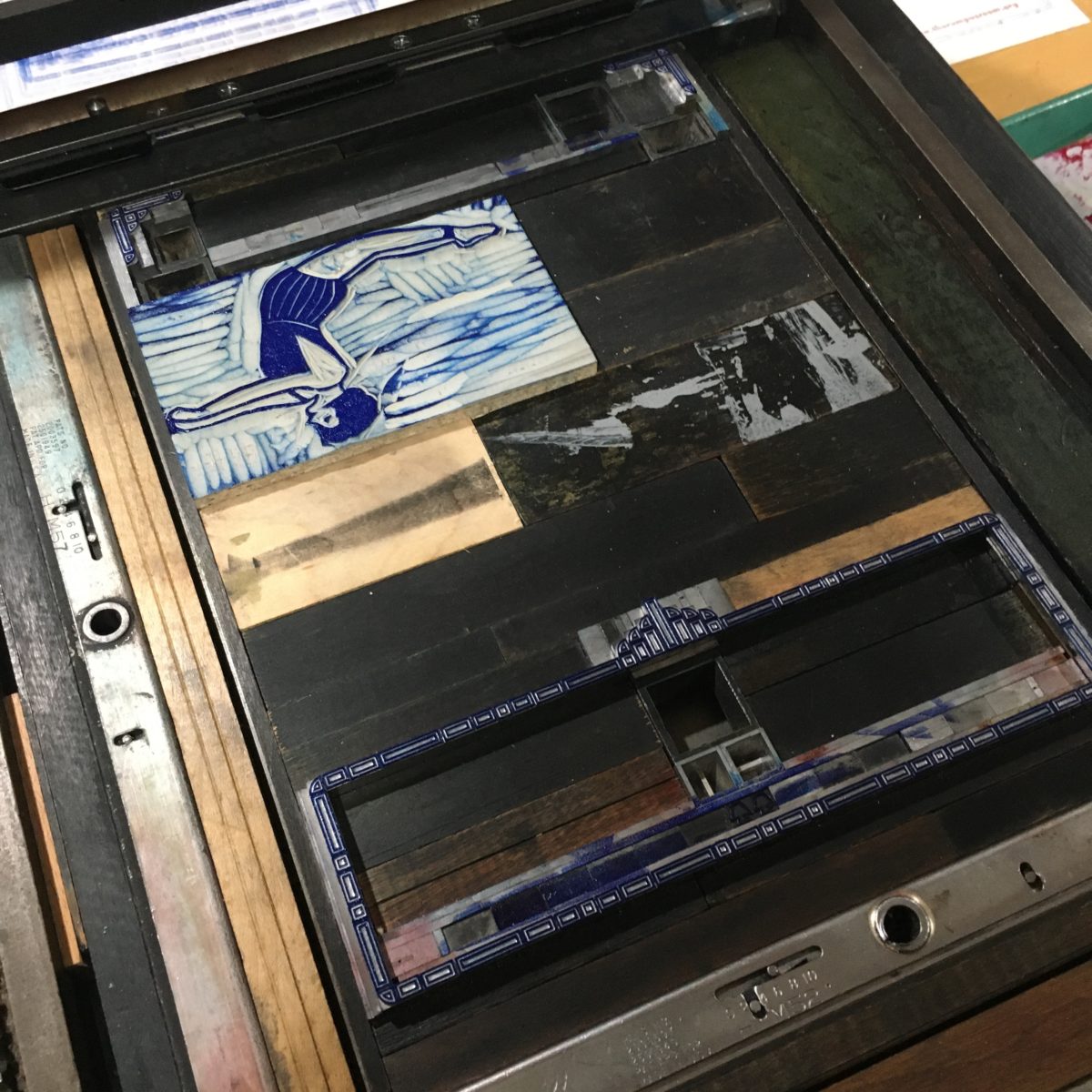
This still felt a little empty, so I started looking at as many 1920’s circus posters as I could find, looking for a visual element I could add in. Finally, I found a lady acrobat with a 20’s hair bob and 20’s style costume, and she seemed like a good fit, so I did a simplified sketch, worked out positioning and size using scans of a printed proof of my text on my tablet, printed out a template, and traced her on to a linoleum block to carve.
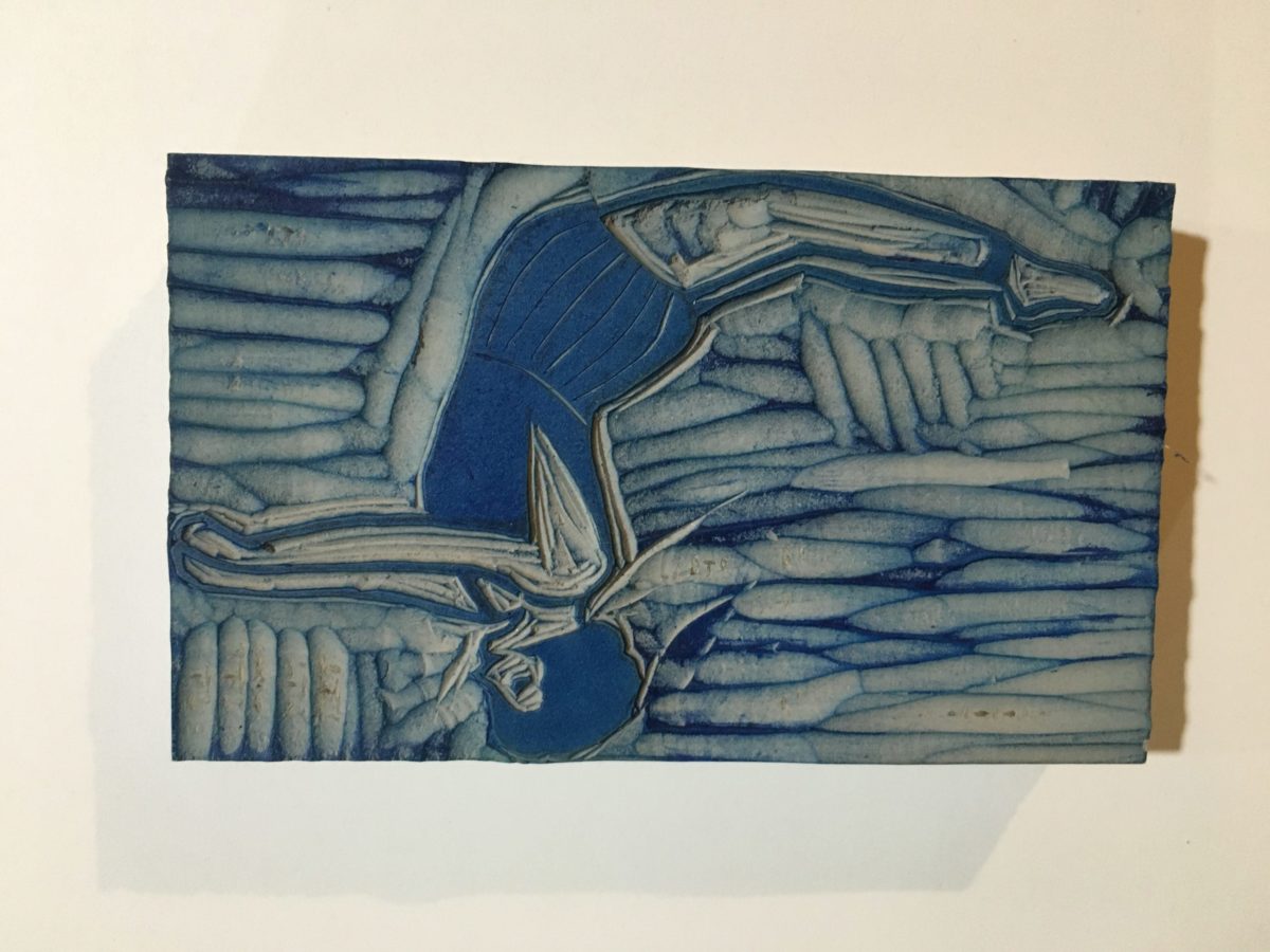
This was the perfect addition, bringing the circus to the poster as she flipped right off the word “Flippers” and headfirst into “Flappers.”
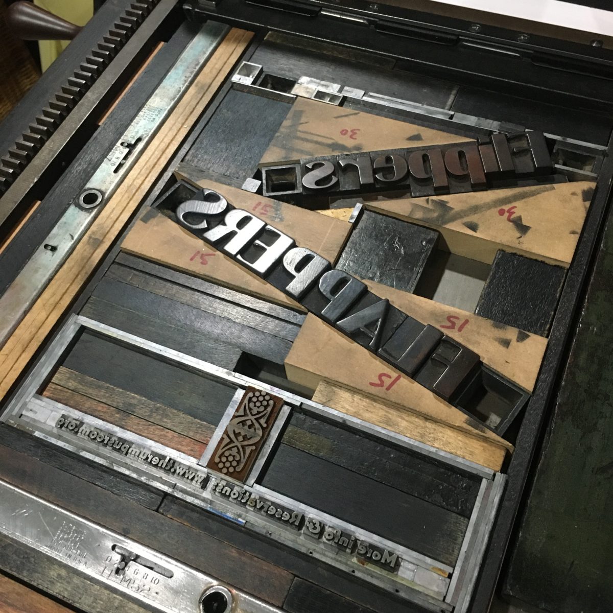
Next step: color separations to really bring the poster to life. I went with Red, Blue, and Black to stick with the Bright colors that lithographic posters of the period tended to use. Since I had scans, I proofed these on my tablet as well. When I had a scheme I liked, I started the work of carefully extracting and setting aside the type and ornaments that were to be blue and black. The titles needed to be printed at a somewhat tricky angle that was already set up, and since they were to be printed red, red was up first. After each color, the printed colors are swapped out for the next set, carefully keeping all the spacing material in place so that everything lines up correctly in the finished print!
Since I don’t have a large press that works for long production runs, I printed a limited edition of 20, and then did a high-resolution scan that we sent off to a commercial print shop for color printing copies to put up around town, and also digitally scaled the poster down to quarter-size for handbills.
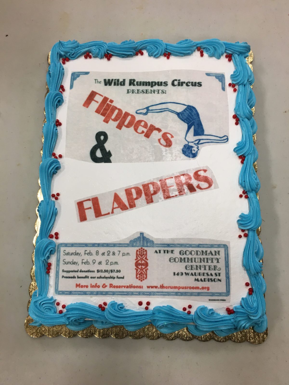
CODA: At the cast party at the end of the show, I got to see a first for me—my letterpress design transferred on to a cake!